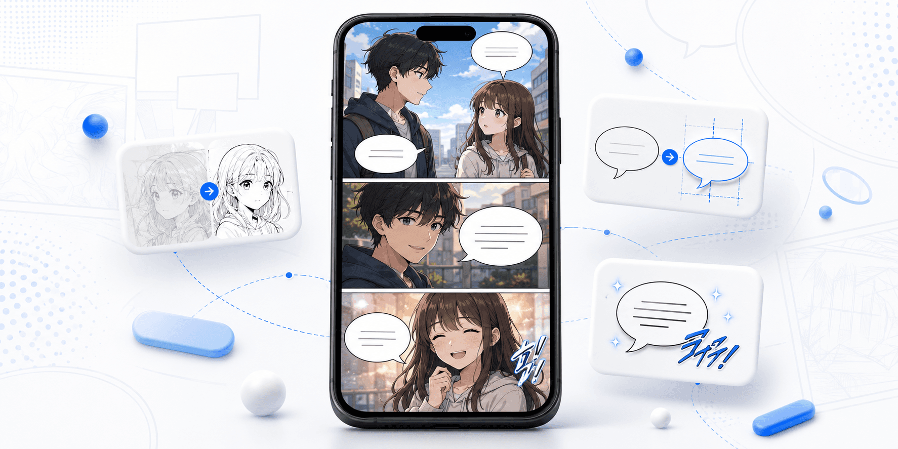
The global explosion of webtoons has fundamentally changed the comics landscape. No longer confined by borders or physical printing costs, a gripping story from Seoul or Tokyo can captivate millions of readers in New York or Paris within hours of release. However, this digital velocity hides a complex challenge. The journey from a source-language comic to a polished, globally ready webtoon isn't just about swapping text; it's about preserving an experience.
When a reader scrolls through a localized webtoon, they shouldn't be thinking about the translation. They should be laughing at the jokes, swooning at the romance, or gasping at the cliffhangers. The moment they stop to squint at tiny text, puzzle over an awkward phrase, or get distracted by a clumsy sound effect redraw, the immersion breaks. The magic is gone.
The gap between a raw translation and an immersive reading experience is bridged by professional localization and typesetting. It is a meticulous production process that balances linguistic nuance with strict visual constraints. For publishers and platforms, getting this right is the difference between a viral hit and a forgettable flop. For creators, it’s about respecting your own art enough to ensure it lands with the same impact in every language.
This guide is a practical, end-to-end walkthrough of that production reality. We will move beyond theory and dive into the workflows, rules, and quality checks required to produce webtoons that look and feel "native" to their target audience, ensuring your stories survive the journey across cultures intact.
The Core Workflow: A Symphony of Text and Art
A professional webtoon localization pipeline is not a linear relay race where a translator hands a script to a designer and walks away. It is an integrated ecosystem where linguistic decisions dictate visual realities, and visual constraints force linguistic adaptations. A successful workflow generally follows four critical phases.
Phase 1: Asset Preparation and "Cleaning"
Before a single word is translated, the canvas must be prepared. Webtoons are vertical, scrolling media, often delivered in massive layered files (PSDs) or sliced image files. The first step is analyzing these assets. Are the speech bubbles on separate layers from the artwork? Are sound effects (SFX) flattened onto the background characters?
"Cleaning" is the process of removing the original language text from speech bubbles and, more challengingly, removing SFX and background text that is integrated into the art. This requires skilled graphic artists who can rebuild the underlying artwork—drawing in parts of a wall, a sky, or a character's hair that was previously obscured by a giant Japanese or Korean sound effect. The quality of this cleaning dictates the final polish; poorly cleaned art leads to ugly smudge marks behind the new English text.
Phase 2: Translation and Spatial Adaptation
Once the script is extracted, translation begins. But webtoon translation differs significantly from translating a novel. The translator is not working with an infinite blank page; they are working within fixed visual containers—speech bubbles—designed for a different language.
Asian languages (like Korean, Japanese, and Chinese) are generally much denser than English. A sentiment conveyed in four concise characters might require a twelve-word sentence in English. If a translator simply provides a literal, accurate translation, the text will physically overflow the speech bubble.
Therefore, this phase is less about translation and more about "adaptation" or "transcreation." The goal is to capture the core intent, tone, and emotional impact of the original line using the most concise English possible. This often involves ruthlessly cutting filler words, using contractions, and restructuring sentences to be punchier. It’s a constant negotiation between meaning and space.
This is the stage where production bottlenecks happen if the team doesn't understand the mechanics of fitting text. The translator must provide a script that is "bubble-ready." For a deep dive into the specific techniques used to condense language without losing meaning, refer to our foundational guide on How to Fit English Text Into Speech Bubbles. Furthermore, when faced with an impossible fit, translators need a tactical approach to deciding when to cut text versus when to split a bubble, strategies detailed in our Bubble Fit Playbook: Shorten, Restructure, or Split?.
Phase 3: Typesetting and Lettering
Once the script is adapted, it moves to the typesetter. In traditional comics, this is called lettering; in digital webtoons, it is typically called typesetting. This role sits squarely between graphic design and editorial.
The typesetter’s job is to place the English text into the cleaned bubbles and scenes so that it looks natural. They choose fonts that match the tone of the dialogue—a standard comic sans for normal speech, a shaky font for fear, a bold, blocky font for shouting. They aren't just dumping text into a box; they are sculpting it. They manually insert line breaks to ensure the block of text forms a pleasing shape (usually a diamond or oval) that sits comfortably in the center of the bubble, rather than a rigid square that bleeds near the edges.
Phase 4: The Final Polish (SFX and Backgrounds)
The final layer of immersion is handling non-dialogue text. Sound effects define the atmosphere of a comic. A CRASH looks different than a whoosh. The localization team must decide whether to leave the original SFX raw (perhaps with a small translation note), or to fully redraw and replace them with localized English graphic text.
Replacing SFX is time-intensive but offers the most premium experience. It requires the typesetter to not only select an appropriate font but often to warp, texture, and apply effects to the text so it feels like part of the original illustration. For a breakdown of the different strategic approaches to this complex task, see SFX Localization: Translate, Keep, or Hybrid? (With Examples). Similar care must be taken with signs, phone screens, and handwritten notes within the art, ensuring they are translated without destroying the original composition, a process detailed in How to Localize Signs and Background Text Without Over-Editing.
Key Constraints and Golden Rules for a Professional Look
To ensure your production pipeline yields high-quality results consistently, your team must adhere to a set of "golden rules" tailored for the mobile-first, vertical format.
Rule 1: Mobile Readability is Non-Negotiable
The vast majority of webtoon readers are on smartphones. This imposes a hard physical constraint on your production: font size. A font that looks acceptable on a 27-inch designer's monitor will be illegible on a 6-inch phone screen.
There is a "readability floor" below which you cannot go. If an adapted line of text doesn't fit inside a bubble at a legible size, the solution is never to use the "shrink ray" and reduce the font size until readers have to squint. The solution is to send the script back for a shorter adaptation or to split the speech bubble. Maintaining this standard is crucial for looking professional. To understand the specific typographical standards that industry leaders use, review the Font & Readability Rules That Make Webtoons Look “Official”.
Rule 2: The Geometry of Bubble Shaping
A speech bubble is rarely a perfect rectangle; it’s usually an oval, a cloud, or a rounded polygon. A common mark of amateur typesetting is taking a sentence, center-justifying it, and plonking the resulting square block of text into a round bubble. The corners of the text block will feel cramped against the rounded edges of the bubble, creating uncomfortable visual tension.
Professional typesetting involves "shaping" the text. By manually adjusting line breaks, the typesetter sculpts the text block into a diamond or hexagonal shape that mimics the container it sits in. This creates balanced white space around the text, making it feel lighter and easier to read. Mastering this visual balance is essential, as explained in Text Centering and Spacing: Why Your Typesetting Feels Off.
Rule 3: Consistency is King (The Series Bible)
Webtoons are long-running serials, often spanning hundreds of episodes over several years. It is common for localization teams—translators, editors, and typesetters—to change over the life of a series. Without strict guardrails, chaos ensues.
A character’s ultimate attack name might change from "Phoenix Drive" in episode 50 to "Firebird Strike" in episode 75. A key location’s spelling might drift. This "episodic amnesia" is jarring for dedicated readers and damages the integrity of the world-building. Every production must maintain a centralized, "living" glossary or series bible that tracks approved terms, character names, relationship dynamics, and font styles. This simple step prevents massive headaches down the road, as outlined in Name Consistency in Webtoons: A Simple Glossary That Prevents Chaos.
Common Mistakes That Scream "Amateur"
Even with good intentions, many localization efforts fall into common traps that degrade the final product. Recognizing these is the first step to avoiding them.
The "Shrink Ray"
We mention it again because it is the most common and damaging mistake. Prioritizing literal translation over readability by shrinking fonts to microscopic sizes turns entertainment into an eye test. If the reader has to pinch-to-zoom to understand basic dialogue, the localization has failed.
Over-Editing the Art
In an enthusiastic attempt to localize everything, teams sometimes scrub away too much of the original art. Redrawing a complex background just to translate a tiny, inconsequential shop sign can sometimes lead to weird, flat-looking patches in the artwork if the redraw isn't perfect. Knowing when to leave background text alone because it doesn't impact the story is a sign of a mature production team.
Typographic Monotony
Using the same generic comic font for everything—whispers, shouts, robot voices, monster growls—flattens the audio landscape of the comic. Just as the original artist used different visual cues for different tones, the localized version must use typographic variation to convey volume and emotion.
The QA Checklist: The Final Gate
You cannot rely on a linear process where the work just ships after the typesetter finishes. A dedicated Quality Assurance (QA) phase is essential. This final check must be performed on an actual mobile device to simulate the end-user experience.
Before any episode is published, it should pass a rigorous inspection. This isn't just about checking for typos; it's a holistic review of the reading experience. For a comprehensive punch list to use during this phase, refer to our QC Checklist for Webtoon Episodes: Overflow, Punctuation, Tone, Continuity.
At a minimum, your final check must ensure:
Readability: Is every bubble effortlessly legible on a phone screen?
Flow: Do the line breaks feel natural, or do they interrupt the cadence of the sentence?
Visual Integrity: Is the text centered and balanced within the bubbles? Are cleaned backgrounds behind SFX seamless?
Consistency: Do names and terms match the established glossary?
Tone: Do the font choices match the emotional intensity of the scenes?
Conclusion
Webtoon localization and typesetting is a balancing act that sits right at the intersection of literary art and graphic design. It requires a deep respect for the original creator's vision—both textual and visual—while adapting it ruthlessly for a new audience and a restrictive format.
When done poorly, localization mutilates the art and alienates the reader with clunky, unreadable text. But when done well, it is invisible. The reader is sucked completely into the story, unaware of the complex technical workflow that made their experience possible.
Don’t let bad localization break your art. Your webtoon deserves dialogue, captions, and story flow that feel natural in every language while still fitting the rhythm of vertical scrolling comics. Ready to bring your series to global readers without losing the emotion, pacing, or readability of the original? Download Feels Local and try it on your next episode for free. When you’re ready to localize faster, polish every line, and scale your workflow with confidence, subscribe to Feels Local and make every story feel truly local.

