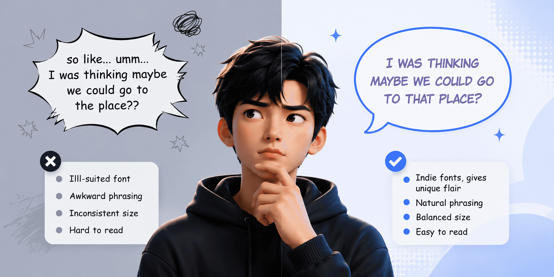
When you open a top-tier webtoon on a major platform, there’s an immediate sense of polish. The art is crisp, the story grips you, and crucially, the text feels native to the experience. You don't stumble over awkward phrasing, squint at tiny letters, or get distracted by jarring font choices. This invisible quality—the feeling that a localized comic is "official" and professional—is often the result of rigorous adherence to typography and readability rules. For creators and publishers looking to compete globally, mastering these rules isn't just an aesthetic choice; it's a fundamental requirement for user engagement and retention on mobile devices.
Quick Answer
Making a localized webtoon look "official" relies on prioritizing mobile readability above all else. This means establishing a strict minimum font size (typically 14px-16px for body text), using clean, professional comic-style fonts (like Wild Words or Anime Ace) instead of generic system fonts, and employing typographic variation (bold, italics, different font styles) to convey tone, volume, and character voice. Furthermore, text must be flawlessly centered and balanced within speech bubbles, avoiding the "cramped square" look that betrays amateur typesetting.
The Mobile-First Mandate: Readability is King
The single most important rule in webtoon typography is that the medium dictates the design. Webtoons are consumed primarily on smartphones, often in less-than-ideal conditions like a bumpy commute or a dimly lit room. If a reader has to pinch-to-zoom just to understand basic dialogue, the localization has failed.
Official-looking webtoons have a "readability floor." This is a hard rule: body text should never be smaller than what is comfortably legible at arm's length on a standard 6-inch screen. While exact pixel values depend on the canvas resolution, a good rule of thumb for standard webtoon dimensions (e.g., 800px wide) is a minimum font size of roughly 14px to 16px.
This constraint directly impacts the translation process. If a translated line is too long to fit a bubble at the minimum font size, the solution is not to shrink the text. The solution is to shorten or restructure the translation. This vital interplay between linguistic economy and visual constraint is a core theme in How to Fit Translations Into Speech Bubbles, where we explore strategies for concise adaptation.
The Font Choice: Ditching Comic Sans for Pro Styles
Nothing screams "amateur localization" faster than seeing a webtoon typeset entirely in basic Times New Roman, Arial, or the infamous Comic Sans. These fonts were designed for documents, not for the dynamic, emotive world of comics.
Official webtoons use specialized comic fonts that are designed to be highly legible while still feeling hand-drawn and expressive. Industry standards include fonts like Blambot’s "Wild Words," "Anime Ace," or similar professional-grade comic lettering fonts. These fonts have subtle imperfections and variations in line weight that mimic traditional pen-and-ink lettering, helping the English text integrate seamlessly with the artwork rather than sitting on top of it like a sterile label. Selecting the right font library is a foundational step in building a professional localization pipeline, as detailed in our Web Comic Localization & Typesetting: A Practical Production Guide.
Typographic Acting: Using Fonts to Convey Tone
In the original language, the artist often uses different visual cues in the speech bubbles to indicate tone—a jagged bubble for shouting, a cloudy one for internal thoughts. The localized text must match this "typographic acting."
Using the same font for a whisper, a normal conversation, and a terrified scream flattens the emotional landscape of the comic. A professional typesetter uses a palette of font styles. Standard dialogue gets the primary comic font. Shouting gets a bolder, perhaps slightly larger and more jagged version. Internal monologues or whispers might use a slightly different, softer font style, often italicized. Robot or system voices get a mechanical, monospaced font.
This variation isn't just decoration; it's essential storytelling. It guides the reader's inner ear, ensuring they "hear" the dialogue with the intended emotional weight. Ignoring these nuances is a prime example of how poor localization can degrade the original work, a trap discussed in Webtoon Localization: Translate Comics Without Breaking the Art.
The Geometry of Balance: Centering and Spacing
Even with the right font and size, a bubble can still look "off" if the text isn't arranged correctly within it. A common mistake is to take a sentence, center-justify it, and plonk the resulting square block of text into a round bubble. The corners of the text block will feel cramped against the curved edges, creating uncomfortable visual tension.
Professional typesetting involves "shaping" the text block. By manually adjusting line breaks, the typesetter sculpts the text into a shape that mimics the container—usually a diamond or oval shape for standard bubbles. This creates balanced white space around the text, making it feel lighter and easier to read. It also involves ensuring the text block is optically centered within the bubble, not just mathematically centered, accounting for the visual weight of different lines.
Examples: From Amateur to Official
Let’s look at how the same dialogue bubble can be transformed by applying these rules.
Source Context: A character is angrily shouting a command.
Amateur Typesetting:
Font: Arial (System Font)
Size: 12px (Too Small)
Style: Plain, no bolding.
Arrangement: A single long line, left-justified, sitting at the top of a large jagged bubble.
Critique: It looks like a placeholder. The small, plain font has zero impact, and the placement is awkward.
Official Typesetting:
Font: Wild Words (Pro Comic Font)
Size: 18px (Large and readable)
Style: Bold, all-caps for emphasis.
Arrangement: Broken into three short, punchy lines, center-justified, forming a balanced shape in the middle of the bubble.
Critique: The text screams at the reader. The font choice and size match the intensity of the jagged bubble, and the centered arrangement feels deliberate and professional.
The "Official Look" Checklist
Before publishing a chapter, run every panel through this quick visual audit:
The Squint Test: Can you read all dialogue comfortably on a phone screen at arm's length? If no, increase the font size.
The Font Check: Are you using a professional comic font (e.g., Wild Words) for standard dialogue, not a system font?
The Tone Audit: Do different bubble types (shout, thought, whisper) have distinct font styles or formatting (bold, italic)?
The Balance Check: is the text block shaped (e.g., diamond shape) and centered within the bubble, with balanced white space around the edges?
The Consistency Check: Do key terms and character names match the established series glossary?
Conclusion
Achieving an "official" look for your localized webtoons isn't about expensive software or secret techniques. It’s about rigorously applying fundamental rules of mobile readability and comic typography. By respecting the constraints of the phone screen, choosing the right fonts, and using text to act out the story, you can elevate your localization from a functional translation to a premium, immersive reading experience.
Want your localized webtoon to feel as polished and official as the top titles readers already love? Download Feels Local and try it on your next episode for free. When you’re ready to improve readability, polish every line, and create a smoother mobile reading experience, subscribe to Feels Local.

