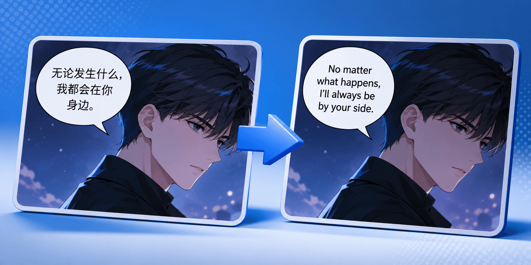
There is a universal groan among localization professionals working with visual media like webtoons, comics, or highly stylized short drama apps: the dreaded "text crush." You receive a beautifully composed source image with a compact, elegant Japanese or Chinese phrase nestled perfectly inside a small speech bubble. Then, you translate it into English, and suddenly you have a sprawling sentence that overflows the boundaries, obscuring the artwork and ruining the visual balance. The immediate temptation for many is to grab the font slider and just keep shrinking the text size until it fits inside the lines. Resist that urge. Resizing is not localization; it’s a recipe for unreadable content that frustrates users, especially on mobile devices. Mastering the art of fitting English into tight visual spaces is about linguistic adaptation and smart shaping, not typographic brute force.
Quick Answer
Fitting expansive English text into restrictive speech bubbles requires a shift from literal translation to "transcreation" and strategic typesetting. Instead of shrinking the font size to an unreadable level, you must first condense the phrasing. Focus on the core intent and emotion of the line, ruthlessly cutting filler words, redundant adjectives, and complex grammatical structures. Secondly, you must manually shape the text block using strategic line breaks to match the physical shape of the bubble (usually an oval or diamond), ensuring a visually pleasing center of gravity rather than a cramped square of text.
The Geography of Language: Why English Sprawls
To solve the problem of overflowing text, we must first understand why it happens almost universally when moving from Asian languages to Western ones. The root cause lies in the fundamental differences in information density between source languages typically found in webtoons (like Chinese, Japanese, and Korean—collectively CJK) and English.
CJK languages often use logograms or syllabaries, where a single character can convey complex meanings or entire words. They are incredibly information-dense vertically. English, by contrast, is a phonetic language that relies on combinations of multiple letters to form words, and crucially, requires spaces between every single word. A sentiment that takes four concise characters in Korean might require a twelve-word sentence in English.
When you are dealing with a fixed visual container like a speech bubble originally designed for a dense language, English will almost always feel like trying to pack a winter coat into a carry-on suitcase. If you simply paste a literal translation into the bubble, you break the visual flow. This pervasive issue is why understanding the broader philosophy of Webtoon Localization: Translate Comics Without Breaking the Art is so critical; preserving the art means respecting the space it provides.
Practical Rule 1: The Art of the Concise Chop (Transcreation)
The primary tool for fitting text isn't a smaller font; it's concise editing. You must prioritize emotional impact over literal fidelity. This is where localization differs from translation. Your goal is to convey the same feeling in the same amount of space, even if the words change.
English is full of "filler" words that we use in natural speech but are unnecessary for conveying meaning in a constrained space. Words like "that," "just," "really," "very," "well," or "you know" can often be cut without changing the core message. Similarly, passive voice takes up significantly more space than active voice. Instead of "The ball was thrown by him" (6 words), use "He threw the ball" (4 words).
When approaching a tight bubble, ask yourself: What is the absolute minimum information needed to convey this character's intent? If a character is yelling confusedly, a literal translation might be, "I don't understand what is happening right now!" A concise adaptation for a small bubble might simply be, "What's going on?!"
Practical Rule 2: Shaping the Text Block (Typesetting)
Once you have condensed the text as much as linguistically possible, the challenge moves to typesetting. Speech bubbles are rarely perfect rectangles; they are usually ovals, circles, clouds, or rounded polygons.
A common mistake is taking a three-line English sentence and center-justifying it as a perfect square block. When you place a square block of text inside a round bubble, the corners of your text block will likely bleed out of the rounded edges of the bubble, while massive amounts of white space are left unused at the top and bottom.
Professional typesetting involves manually arranging line breaks to "sculpt" the text into a shape that mimics the container. For a standard vertical oval bubble, this usually means creating a "diamond" shape: a shorter top line, longer middle line(s), and a shorter bottom line. This technique is essential for creating a visually balanced panel and is a core skill detailed further in our Web Comic Localization & Typesetting: A Practical Production Guide.
Practical Rule 3: Strategic Line Breaks for Flow
While shaping the text block is important visually, you cannot ignore the grammatical flow of the sentence. You shouldn't break a line just to make a nice shape if it makes the sentence difficult to read.
Try to break lines at natural grammatical pauses—after commas, before conjunctions (like "and" or "but"), or between distinct clauses. Avoid "orphaning" single short words on their own line if possible, as it looks messy. The goal is a balance between a pleasing visual shape and natural reading rhythm. Achieving this balance requires close collaboration between translators and typesetters, a relationship explored in depth in How to Fit Translations Into Speech Bubbles.
Examples: From Overflow to Optimized
Let’s look at how a raw translation transforms into a bubble-ready localized line using these rules.
Scenario 1: The Villain Threat (Conciseness Focus)
Source Idea (Dense): You are completely trapped and have nowhere left to run.
Literal Translation (Too long): "You are now completely surrounded and there is absolutely nowhere for you to escape to."
Critique: This will require a tiny font. It's wordy and lacks punch.Localized Adaptation (Just right): "You're surrounded. There's nowhere left to run."
Critique: We used contractions ("You're", "There's"), removed filler adjectives ("completely", "absolutely"), and broke it into two punchy sentences that are easy to stack.
Scenario 2: The Surprised Shout (Shaping Focus)
Source Idea (Dense): Unbelievable shock!
Literal Translation (Awkward shape): "I find this situation to be incredibly shocking!"
Critique: This creates a wide, flat sentence that won't fit a tall, narrow shout bubble.Localized Adaptation (Shaped):
This is
unbelievable!
Critique: By rephrasing to a stronger adjective and breaking it into two short lines, we create a compact, vertical shape that fits perfectly in a narrow bubble without needing to shrink the font.
The Bubble-Fit Checklist (The "Squint Test")
Before you finalize your localized visual content, run your text through this quick audit to ensure readability on mobile devices:
The Squint Test: Can you read the text comfortably on a standard phone screen at arm's length without zooming in? If no, the font is too small.
The Filler Audit: Have you removed every possible unnecessary word (e.g., "that," "just," "very")?
The Shape Check: Does the text block roughly match the shape of the bubble (e.g., a diamond shape for an oval bubble), or are the corners bleeding out?
The Contraction Action: Have you utilized contractions (I'm, we're, don't, it's) wherever the character's tone permits to save space?
Conclusion
Fitting English into tight speech bubbles is a puzzle that requires equal parts linguistic skill and visual awareness. It’s easy to resort to the "shrink ray," but professional localization means respecting the reader's eyes as much as the source text's meaning. By embracing concise editing, smart line breaks, and a willingness to adapt rather than just translate, you can ensure your characters' voices are heard loud and clear, no matter how small the bubble.
Localization is a visual art form, especially when every word has to fit inside a panel, caption, or speech bubble. With Feels Local, you can adapt your webtoon or media text for global readers while keeping the flow clean, readable, and true to the original experience. Struggling with text crush, awkward line breaks, or translations that no longer fit your format? Download Feels Local and try it on your next project for free. When you’re ready to polish faster, improve readability, and scale your localization workflow with confidence, subscribe to Feels Local and make every story feel perfectly placed.

